

Higher User Trust
+99 % returning users
+15.8 % engagement rate
Users are returning to the website more frequently and spending more time interacting with the content.
Finax is among the leading European investment platforms. Over several years, it has grown from a tech startup into an international company operating in multiple markets. Along with the company's growth, the demands for digital experience have also increased.
The original website was developed gradually over several years. Products, content, and functionalities changed, but the information architecture remained based on the organization's internal perspective. At the same time, a new visual brand identity was created by the studio Andrej & Andrej, which redefined Finax's positioning from a platform for people interested in investing to a brand that makes investing accessible to the general public through the idea "Invest and Relax."
The goal was therefore not just to create a new website but to transform the way the digital environment communicates the product's value, builds trust, and guides users through the decision-making process.
Analytical data showed the places where users were leaving the website. However, they did not answer the fundamental question: why.
Finax has long been targeting people who want to invest but often lack previous experience with financial products. For this group, investing represents a combination of high informational demands, low certainty, and the need to trust the brand even before entrusting it with their finances.
If the digital experience cannot remove these barriers, even a quality product cannot fulfill its business potential.
Therefore, we did not start the project by designing screens, but by validating assumptions through user research.
The project started with qualitative research consisting of individual in-depth interviews and moderated usability testing.
The research involved 20 respondents representing the three main target groups of Finax. The common denominator was the willingness to start investing online, but at the same time uncertainty, lack of experience, or using the services of a financial advisor.
The research was conducted through a combination of moderated testing in the ui42 UX laboratory and remote interviews with screen sharing.
The goal was not to evaluate the aesthetics of the website. The aim was to understand the users' way of thinking, identify decision-making barriers, and reveal moments when the digital experience ceases to support business goals.
After navigating through several pages, respondents could not explain the difference between individual products nor clearly identify the value that Finax offers.
Names like “Intelligent Investing” or “Intelligent Annuity” described the company's internal logic, not the customer's need - users therefore got stuck in comparisons and left without making a decision.
Terms like ETF, rebalancing, or automation were unfamiliar to a large portion of respondents. Users did not understand the basic principles of how the product works, which significantly affected their willingness to continue making decisions.
In financial services, the credibility of every detail matters.
Respondents described the original visual style as outdated, the illustrations as unprofessional, and the content as too complicated.
They lacked answers to basic questions regarding fees, fund withdrawals, or investment security. The claim about quickly opening an investment account paradoxically aroused distrust among respondents.
The research identified four main user scenarios through which respondents reached the decision to open an investment account. In all four scenarios, users encountered the same problem: the registration process started before they understood the product.
The CTA “I want to start” was perceived as a binding step towards opening an investment account, which significantly reduced the willingness to continue.
Even respondents who started filling out the investment questionnaire encountered numerous obstacles that frustrated or directly blocked them from completing it. The wording of the questions sometimes seemed too technical, other times unserious, even poetic. Notification messages confused users, and interactive elements like the slider and risk circle did not work intuitively.
The research results became the basis for all design decisions. The project was not a visual redesign. It was a transformation of four key layers of the digital ecosystem.
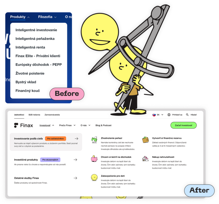
The most fundamental change was the redesign of navigation. Instead of orientation by products, two parallel user paths were created.
The first reflects life situations and investment goals, such as building wealth, investing for children, or preparing for retirement. It is intended for users who do not yet know what product they are looking for. The second remains oriented towards specific products and detailed information for users who already understand investing.
The result is significantly lower information load and a more natural way of orientation.
While the new brand manual was being developed, we prepared wireframes verifying the new information architecture, content hierarchy, and user scenarios. This approach allowed us to separate strategic UX decisions from visual processing and minimize the risk of later changes.
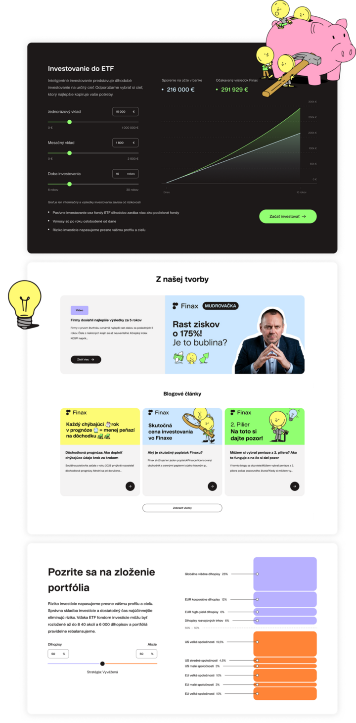
After completing the new visual identity, a complete redesign of the user interface was prepared. The new solution respects accessibility principles according to WCAG, works with higher readability, clearer typography, and a simpler visual language.
In the financial services environment, however, aesthetics was not the goal. Every design decision aimed to strengthen trust and reduce user uncertainty. Information about fees, financial withdrawal options, and security was moved to places where users intuitively looked for them.
We integrated a layer of simple explanatory content into the entire ecosystem - short definitions, infographics, and recommendations for video content directly in the context where the user encounters the term.
Interactive calculators assigned to specific products have been added to the product pages, allowing users to try investment simulations with different amounts and time periods.
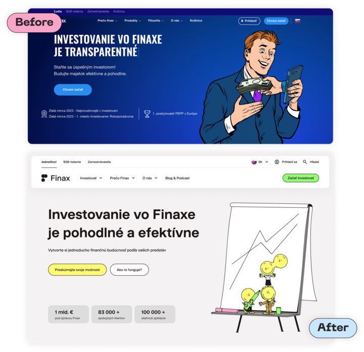
We have rethought the logic of the CTA - instead of a single binding "I want to start" the website guides the user through less binding actions, such as "Explore your options" or "How does it work?" At the same time, we have adjusted the communication to make it clear from the beginning that onboarding is a process leading to real registration, not just obtaining information.
Shortly after launching the new solution, positive changes were evident in all major user metrics.
Users are returning to the website more frequently and spending more time interacting with the content.
The results suggest that the new information architecture makes it easier for users to navigate and reduces the number of situations where they leave the site without interaction.
The website has stopped serving as a landing page and has become a natural part of the digital customer experience.
From UX research through design to deployment - we build digital products that your customers understand and trust.
Contact usThe in-depth user survey provided us with specific, data-driven answers to questions we had previously addressed only intuitively. The findings became the direct foundation for the restructuring of the website, navigation adjustments, redesign of product pages, and simplification of the onboarding process. We appreciate ui42's ability to translate research data into specific recommendations that we could directly implement.

Contact us
Do you want similar results?

Michaela Recht

Samuel Štassel

Martin Papp
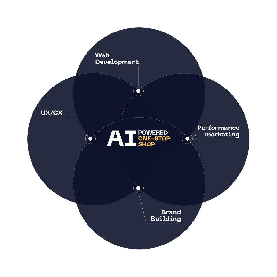
At ui42, we combine strategy, creativity, technology, marketing, and AI into one entity.
We build brands and visual identities, create websites and e-shops, design UX and CRO, create creative content, and deliver measurable results through performance marketing.
Our solutions are enhanced by FLUIDUM – ui42's AI intelligence, which transforms company data into a competitive advantage.
Thanks to this, you gain a partner who can cover the entire digital ecosystem of your business – from the first contact with the brand to conversion.
Don't miss out on the latest news from the world of UX, programming, analytics, and marketing.

Thank you for subscribing!

What do you need help with?
Select all options that apply to you
The form has been sent successfully.