
Forms on websites and applications are probably the most important UX spot where a visitor turns into a customer. During usability testing we still encounter errors that can result in the worst: a frustrated user who leaves the site (to the competition). We bring you an overview of several mistakes and recommendations that we have collected during recent UX research. Use them for example as a checklist to make sure that your users will not be caught in the same trap.
UPDATED: We originally published the blog post on 20.4.2021 and updated it on 8.4.2024.
Validation is evergreen. Let's recall some basic rules
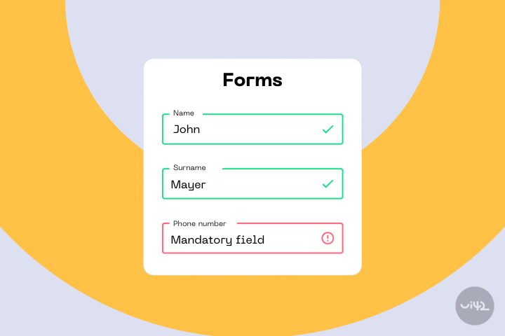
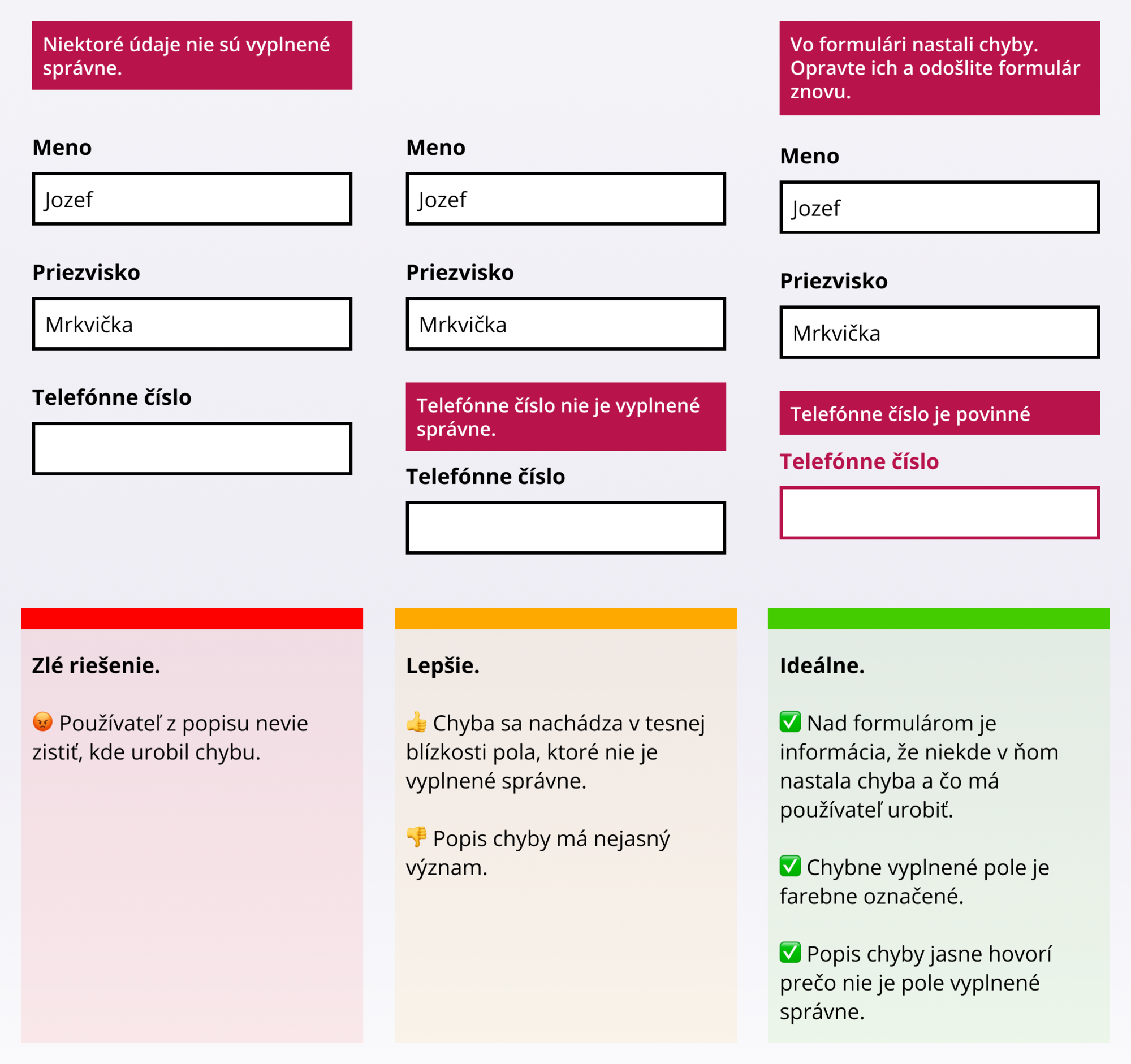
#1 Displaying Errors
If an error occurs while filling in the data, inform the user of this information, show where the error occurred, and also specifically inform how to correct the error.
#2 Display meaningful error descriptions and try to prevent errors
If the user does not know in advance how to fill in a certain field, they will inevitably make a mistake. And with each mistake, some - especially those less technically savvy - lose confidence and the will to complete the form. If we specify, for example, the format of a phone number in advance, we minimize the number of users who make a mistake.
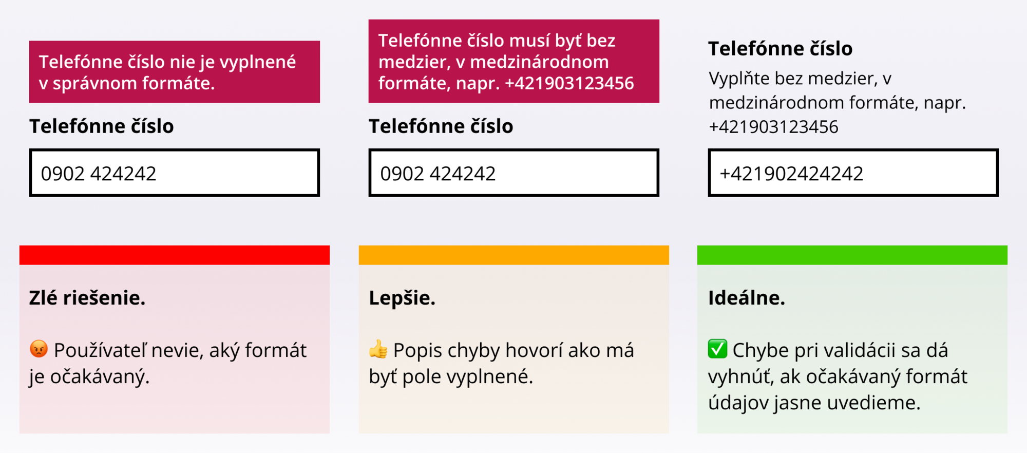
Especially in cases like this, we can prevent errors in other ways. See the following point.
#3 Do not insist on the exact data format
In certain cases, you can "ignore" minor errors. When testing insurance company websites, we found that some did not allow entering a car's license plate (EČV) with a space. So strictly after entering 7 characters, the form was submitted and then displayed an error that the entered data was incorrect. Yet, spaces in a text string can be ignored by a programmer with a quick function, either on the front-end or back-end.
Much more common, however, is requiring phone numbers in international format. If you operate a website in Slovakia and most of your users are from Slovakia, why not simply allow them to enter the number in the local version? After verifying that the format is correct, you can easily add the Slovak prefix when saving to the database. And of course, allow entering the number with a foreign prefix as well.
And thirdly: personal identification numbers. The eternal question to be or not to be in this case is: with or without a slash? Well, you probably already suspect that ideally both. You can easily add or remove this character when saving data. However, don't forget to state that you expect one format or the other, as respondents in our tests paused over this.
A few visual and content tips
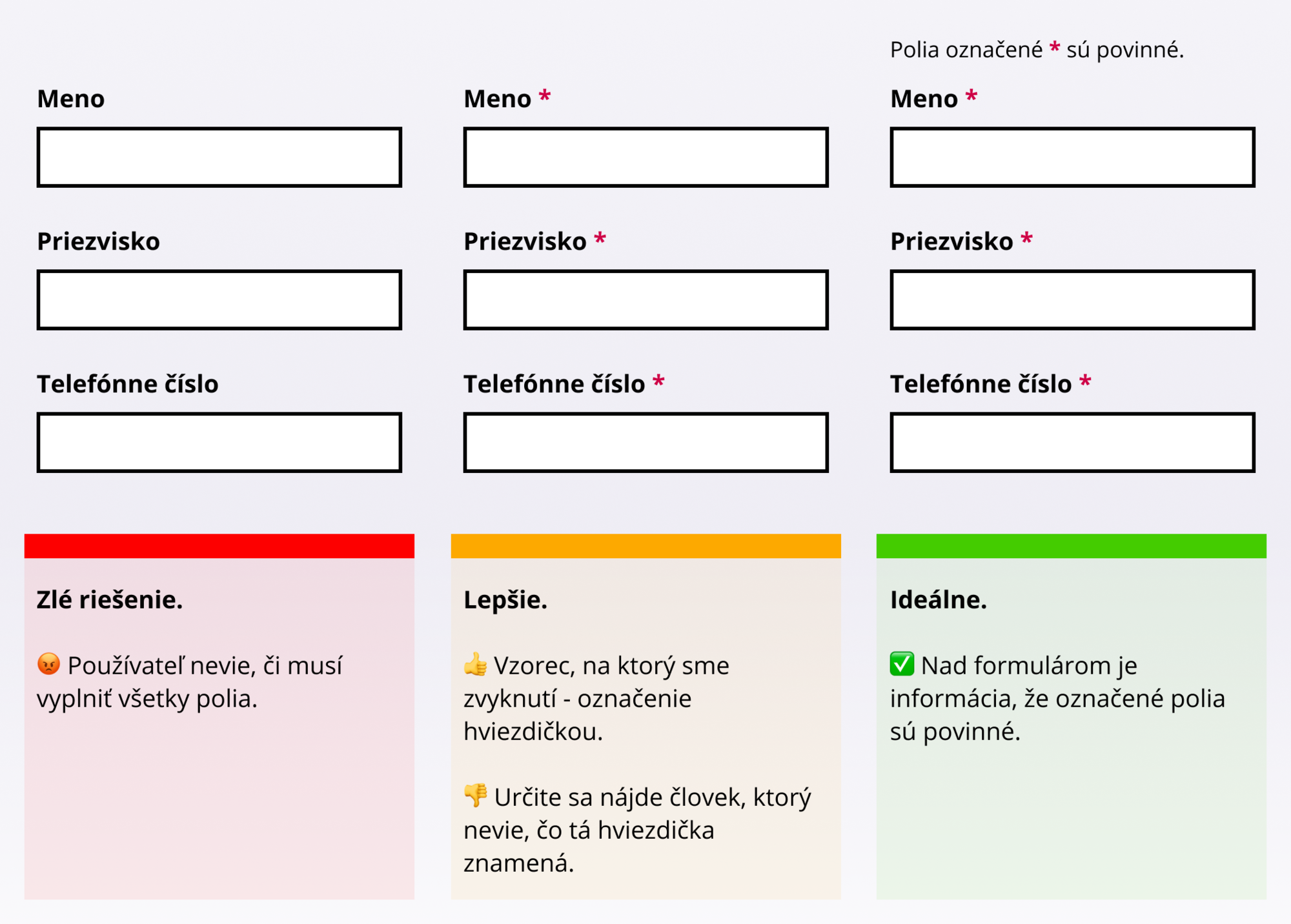
#4 Mark required fields
People expect that it is not necessary to fill in all the data. They automatically look for the marking of required parts, e.g., with an asterisk, etc. (Yes, even if all fields are required.)
If users do not find this information, they try to guess it based on other clues. A respondent in our test, for example, said: "This field has a bold heading, it is probably required." In the given form, all fields were required, and the bold font was the standard style for field labels.
#5 Action triggers reaction, make it known
Especially with forms that serve to calculate the price, make it clear that changing an option will adjust the price of the product or service. Ensure that
- the price change is visually striking,
- the price is placed in a visible part of the page (ideally throughout the form filling),
- the change occurs immediately after the user clicks on the element that causes the recalculation. Every (milli)second more causes the user to not mentally connect the action and reaction.
#6 Let your questions not raise more questions
When testing the travel insurance closing scenario, we encountered a form like the one in the image below.
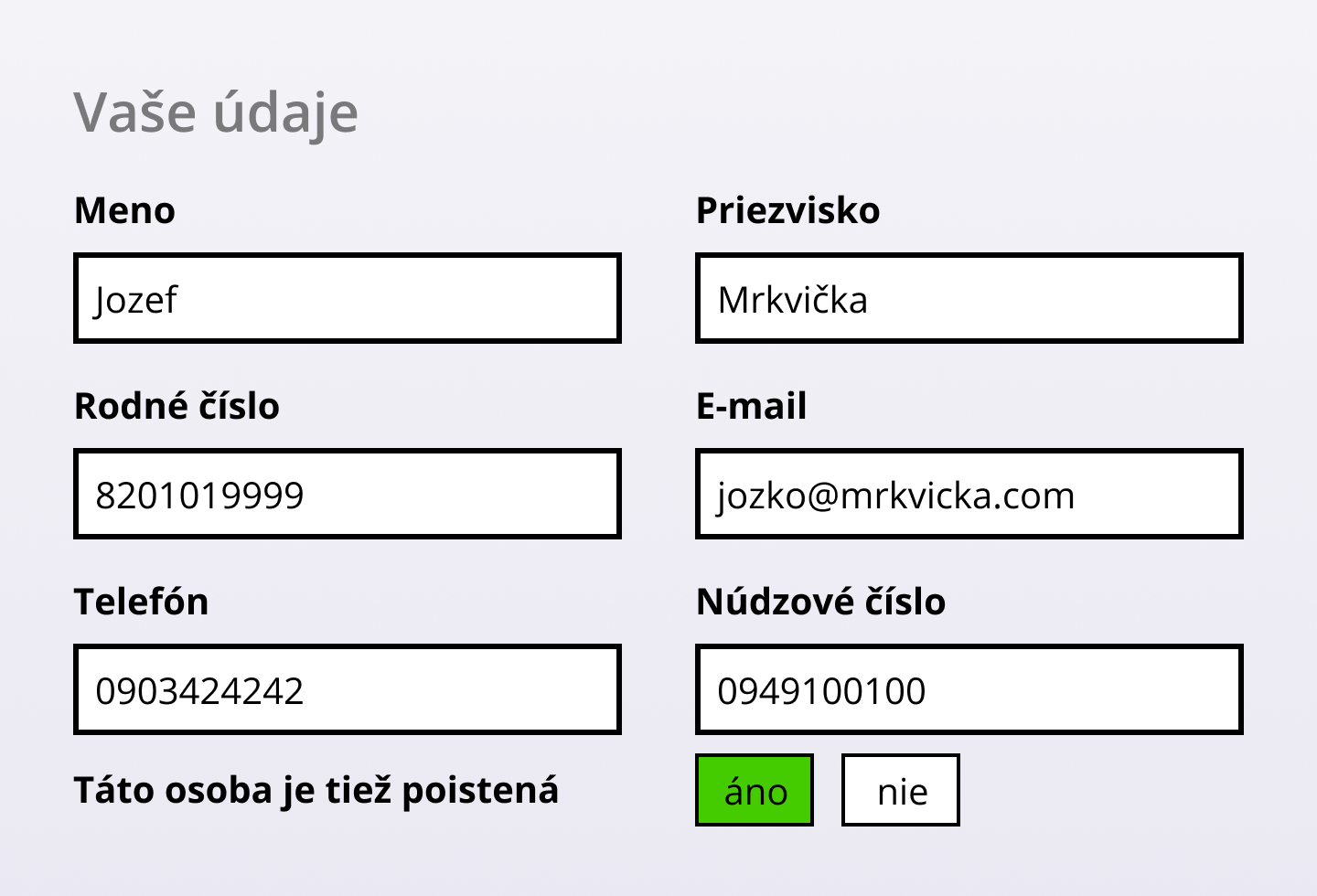
How would you answer the question "Is this person also insured"? Who is actually the insured person? Is it the person filling out the form? Or the person who owns the emergency number? Each question raises a series of other questions, e.g., why should my emergency contact be insured or why does the insurance company care?
In this case, an inappropriate formulation of the question was combined with a violation of one of the principles of Gestalt psychology applied to the user interface. The so-called Law of proximity states that objects that are close to each other are related. In the form from the example, however, the question about the insured person was not related to the emergency number, only the developer simplified the work and placed the yes/no buttons in a column on the right with insufficient spacing from the previous line. This is also why it is not recommended to use multi-column layouts for forms.
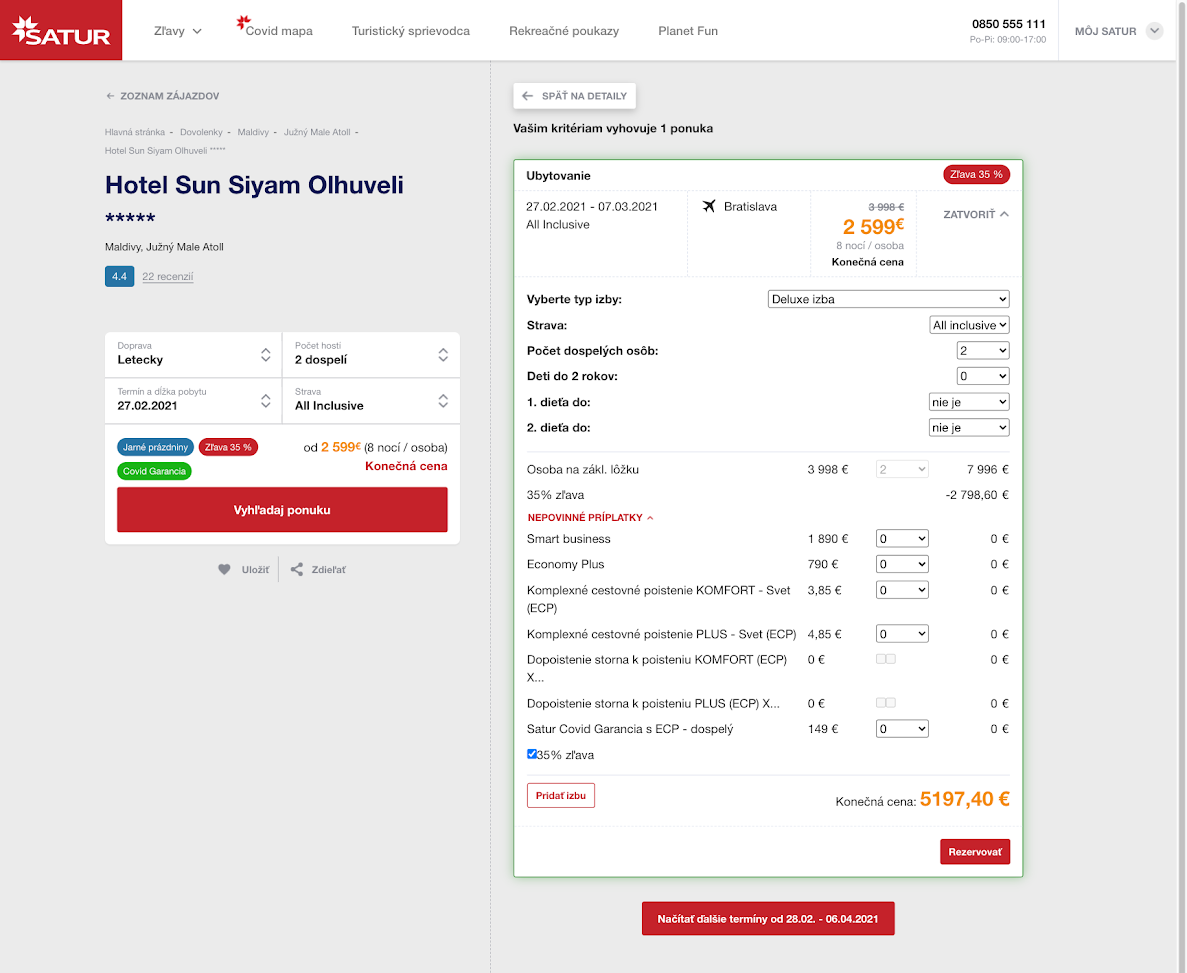
Notice the part of the form "Optional extras" on the CK Satur page. Is it clear to you what Smart business is? What is "Cancellation insurance to PLUS insurance (ECP) X..." and the small squares to the right of this option?
#7 Multi-step forms
Dividing the form into multiple steps can slightly reduce the so-called cognitive load on the user, as they can focus on fewer fields to fill in, the form does not appear very long, and is visually more pleasant. However, pay attention to (among other things) the following:
- Clearly inform the user that the process is divided into steps, how many there are, and where they are currently located.
- If you implement form steps with JavaScript, allow users to return to previous steps with the Back button in the web browser, not just the button you placed on the page (we hope you placed it there). The back button is still one of the most used functions of web browsers.
- If in a certain step you refer to filled information from previous steps, remind the user of the value they chose.
Example: The user orders insurance and in step 1 chooses the start date of validity. In step 3, you ask if "they have insurance with another company for the chosen date" - add this date directly to the question. Otherwise, the cognitive load increases.
Several technical tips mainly for developers
#8 If you have your own "suggesters", make sure they don't clash with the browser
We are talking about autocomplete/suggestion functions, where, for example, when typing a street name, a list of streets in the given city is displayed, and the user does not have to type the entire name. During recent testing, we encountered 2 problems in one form:
- The page required selecting a ZIP code from the offered options. For such a short data as a ZIP code, none of the respondents "bothered" clicking on the offered options but simply typed 5 characters themselves.
- When the number of offered page options narrowed to 1 and at the same time the offer of saved data in the browser appeared, it overlaid the page's autocomplete, and it was not possible to select the given value.
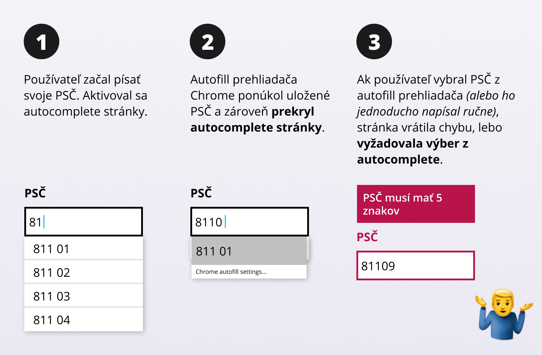
This tested page thus made 2 mistakes: they required selecting a value from autocomplete without assuming that the user might not see it. And during validation, they did not accept a manually entered value, even though it exactly met the criteria. As a result, some test respondents left the form at this step. What else could they do when they filled in a 5-digit ZIP code and got an error that the ZIP code must have 5 characters?
#9 Allow form submission with the ENTER key
It seems like a triviality, but many people are used to clicking less and using the keyboard more. By the way, for these people, it is also important to be able to use the tab key to move between individual form fields. Make sure that in such a case, the correct order of individual elements is maintained (e.g., by setting the tabindex attribute).
#10 If it helps the user, ignore diacritics or its absence
In our test, we saw cases where searching on the page returned different results depending on whether the respondent entered the search word with or without accents. Especially on mobile phones, people write without diacritics. And then there is a large group of people who predominantly work with an English keyboard. Please, don't ignore us :-)
#11 If the user has to choose from a long list of values, allow them to search within them
In very long lists (for example, all countries of the world or car brands), a person on a mobile will "scroll" a bit before reaching a value at the end of the list. Many ready-made libraries like Select2 and others offer ready-made solutions to this problem.
#12 Do not use the select element (dropdown) for few values
Conversely to the previous point, if you have only a few values to choose from, e.g., 2-3, do not display them in the form of a select element but rather radio buttons. The user immediately sees the available values and fills in this data faster.
#13 Use the correct form elements for specific data
When filling in numbers or emails, it is ideal to use the element <input type="email"> or <input type="number"> supplemented with the attribute inputmode="numeric" and pattern="[0-9]*", thanks to which, especially on mobile devices, a modified keyboard is displayed, showing only numbers or the at sign without the need to open special characters.
Similarly, there is also a native option to select a date without the need to implement your own calendar, but support in all browsers is still debatable today. Be careful with calendars regarding their usability, as our Martin Krupa also wrote in the blog Year 2018 - the year of calendars with bad UX. During our last testing, we noticed that people want to enter dates even without using a calendar, and you should not prevent them from doing so.
Further reading
To review the basics, we recommend the article from Nielsen Norman Group:
Website Forms Usability: Top 10 Recommendations. And of course, there are countless resources on the internet.
In our company UX library, for example, there is the book Form Design Patterns from Smashing Magazine, which is exclusively dedicated to forms. Smashing Magazine (in case you didn't know) is a very popular website for web creators founded by Vitaly Friedman, who recently also lectured at our conference MastersGate.
If your customers are not filling out forms or you feel that they contain critical points that would be good to improve, entrust yourself to the hands of experts. At ui42, we will be happy to help you with that. Just contact us.
You can also read about findings on how to improve forms on E-commerce Bridge.