Belda Sport | Case Study Visual rebranding of a premium sports house
Belda Sport is an established premium sports house with a long-standing tradition. The client set an ambition: to align the visual identity with the brand's new high-end position. The original visual no longer corresponded with the quality of the products and the exclusivity of the brick-and-mortar store.
The challenge was to design a new visual system that would be consistent, functional, and at the same time exude elegance, confidence, and a sporting spirit at the highest level.
Project Overview
-
Client: Belda Sport
-
Industry: Premium e-commerce and retail (sports equipment)
-
Company size: Small company
-
Duration of cooperation: From 2025 - cooperation is still ongoing
Our services
Brand strategy
Our process began with an in-depth audit, mystery shopping, and community analysis. We found that Belda is a community place for customers where they seek not only quality but also a personal relationship and advice. Based on market analysis and target segments, we set a clear positioning built on a premium sports experience.
Key Idea: The new visual combines the confidence of fashion and the discipline of sports performance. It communicates sophisticatedly yet naturally and remains true to the fundamental principle that the most beautiful thing about sports is you.
Creative principle
Our strategy was based on the concept of "MORE" – More elegance, more style, more functionality, more experience, more of everything. This message became the driving force for every design step and aligned the tone of communication (elegant, confident) with the brand's ambition.
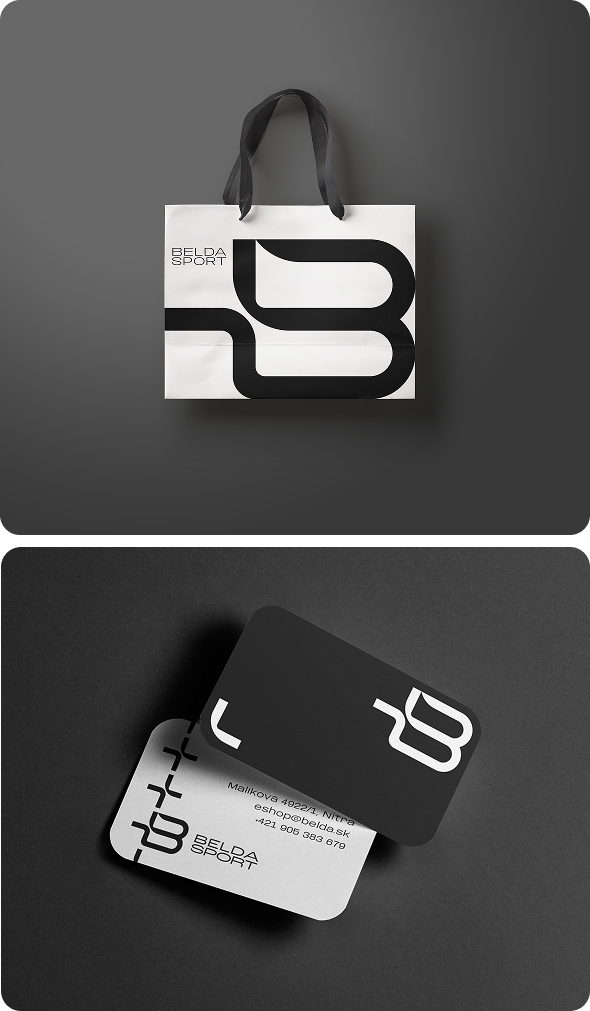
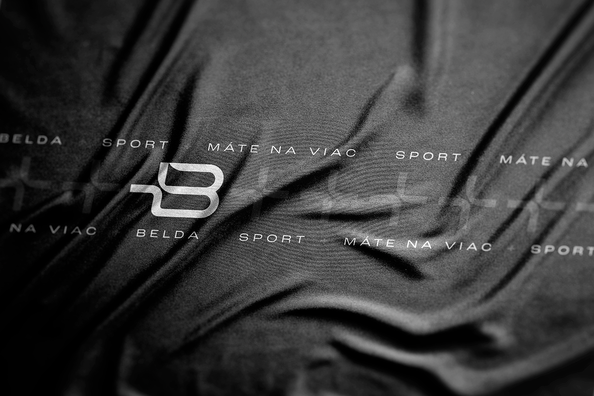
Logo
The original logo was subjectively nice, but it was neither functional nor scalable for various applications. The goal was to evolutionarily move the brand towards a premium expression of the strategy "MORE".
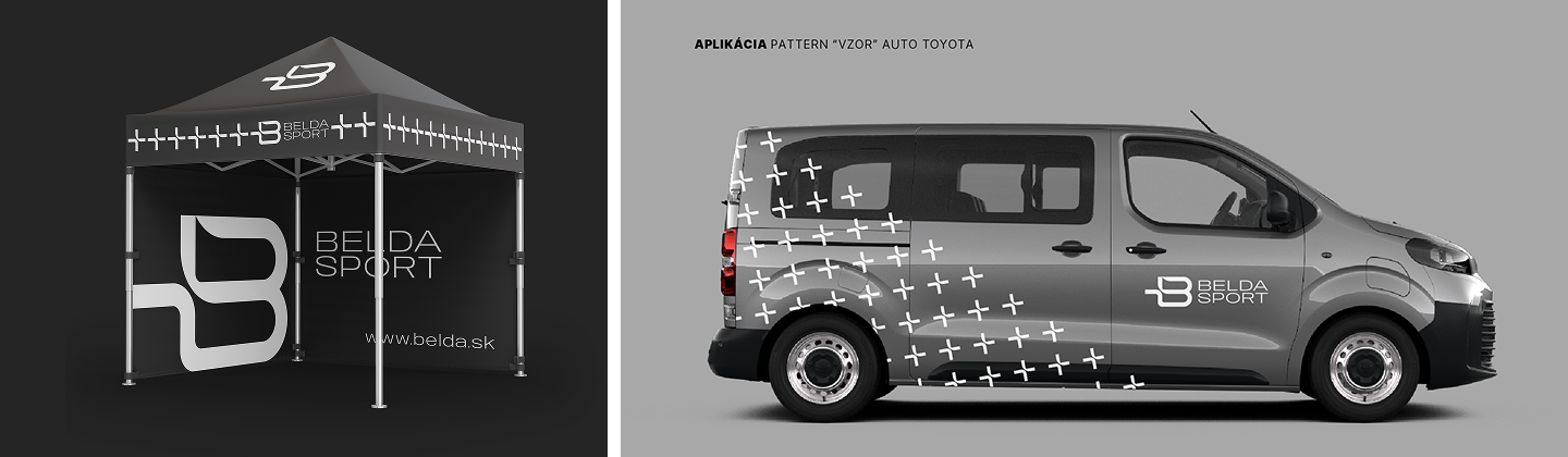
Brandmark: Symbol +
The "+" symbol became the core of the logo. This clean, sophisticated detail represents development, community strength, and the idea of "MORE". It is a dynamic element that evokes athletic performance and technological precision.

Brand strategy
Our process began with an in-depth audit, mystery shopping, and community analysis. We found that Belda is a community place for customers, where they seek not only quality but also a personal relationship and advice. Based on market analysis and target segments, we set a clear positioning built on a premium sports experience.
Key Idea: The new visual combines the confidence of fashion and the discipline of sports performance. It communicates sophisticatedly, yet naturally, and remains true to the fundamental principle that the most beautiful thing about sports is you.
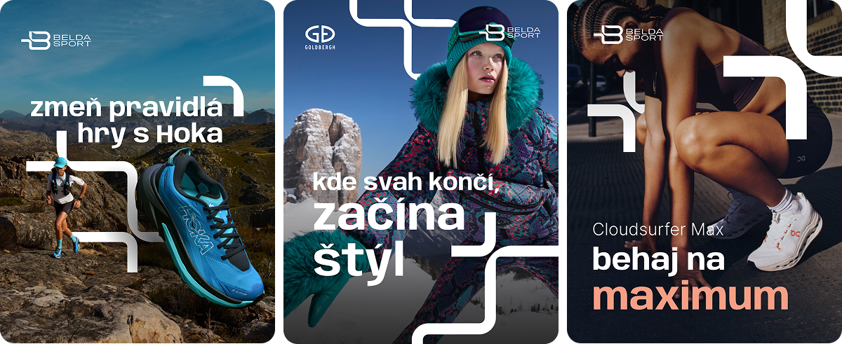
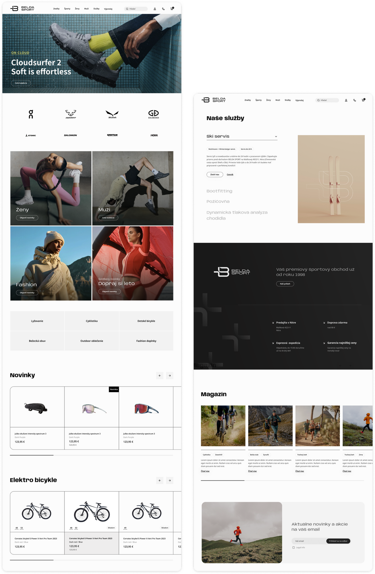
Visual language
The new identity of Belda Sport is designed to exude premium quality not only through words but through a comprehensive visual expression at every touchpoint. We have created three brand patterns that hold strategic significance and add depth and tactility to the visuals.
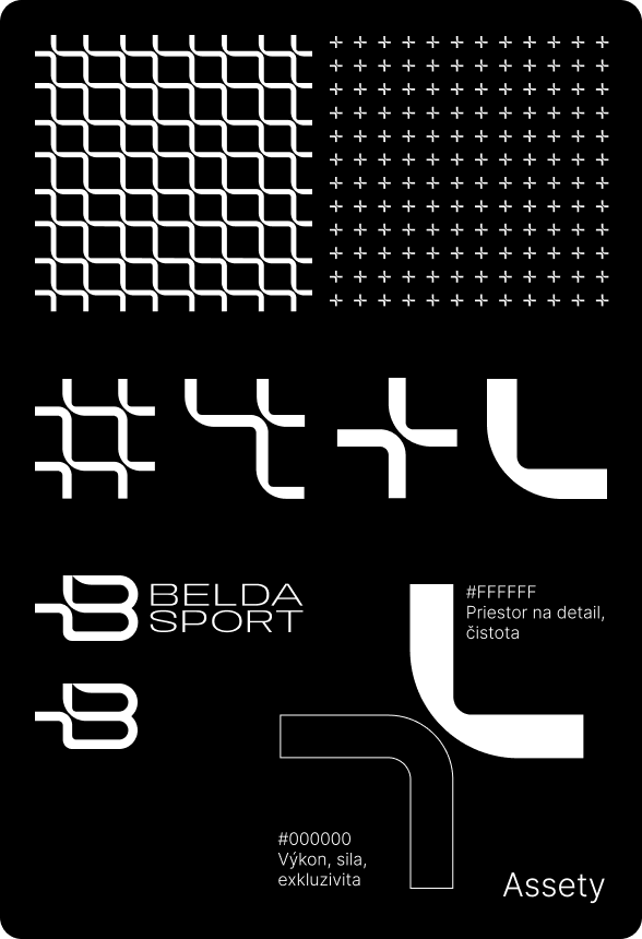
Brand assets
A complete library of brand assets ensures consistent deployment across all media. This includes a comprehensive brand manual, design of offline media – from totems, windows to stickers – and the design of quality packaging.