Case Study | HNonline.sk Redesign of the news portal

Client
Hospodárske noviny / MAFRA Slovakia, a. s.
The largest and longest-running economic daily on the Slovak market, with an emphasis on trustworthy news and quality analytical content.
Context
The digital behavior of media readers is changing faster than ever before. Content consumption is fragmented, users expect quick navigation, clarity, and a consistent user experience across devices.
HNonline.sk has been recording stable growth in its digital audience for a long time, even though most of the content is available in the paid section. The challenge was not to "chase trends," but to maintain growth, strengthen trust, and improve content management without disrupting the strong brand identity of HN.
Solution (ui42 approach)
The redesign of HNonline.sk was created in close collaboration between the teams of Hospodárske noviny and our specialists in service design and user experience. It was not a cosmetic design adjustment, but a strategic process based on data, analysis, and clear prioritization of opportunities.
The goal of the redesign was:
- to improve user experience
- to simplify content navigation
- to modernize the visual language
- to prepare the platform for further development of digital services
Procedure and Opportunity Strategy
1. Reader Experience Audit (CX & UX Audit)
At the beginning, we took a detailed look at the reader experience across the entire portal. We analyzed user behavior, content interaction, website navigation, article readability, navigation, and interface consistency. We identified strong points that needed to be preserved, as well as weak points that hindered user experience and the potential for further growth.
2. Identification of Opportunities
Based on the audit, we identified specific opportunities, from improving content hierarchy, simplifying navigation, to introducing new content and product elements. It was important not to seek solutions in isolation but to perceive the portal as a functional ecosystem.
3. Joint Prioritization with the Client
All identified opportunities were jointly prioritized with the client according to their benefit to the reader, business impact, and implementation complexity. This step ensured that changes with a real impact on user experience and the long-term development of digital services were addressed.
4. Solution Proposal
For each priority opportunity, we proposed specific solutions, from design and information architecture adjustments, new layouts and navigation elements, to content and functionality expansion. Solutions were designed with an emphasis on the reader, accessibility, and future scalability of the platform.
Key areas of redesign
1. Typography, Color Scheme, and Accessibility
We focused on unifying and fine-tuning typography and the color palette with an emphasis on readability, contrast, and accessibility. The goal was to ensure comfortable content reading for a wide range of users.
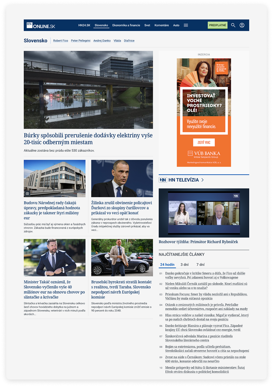
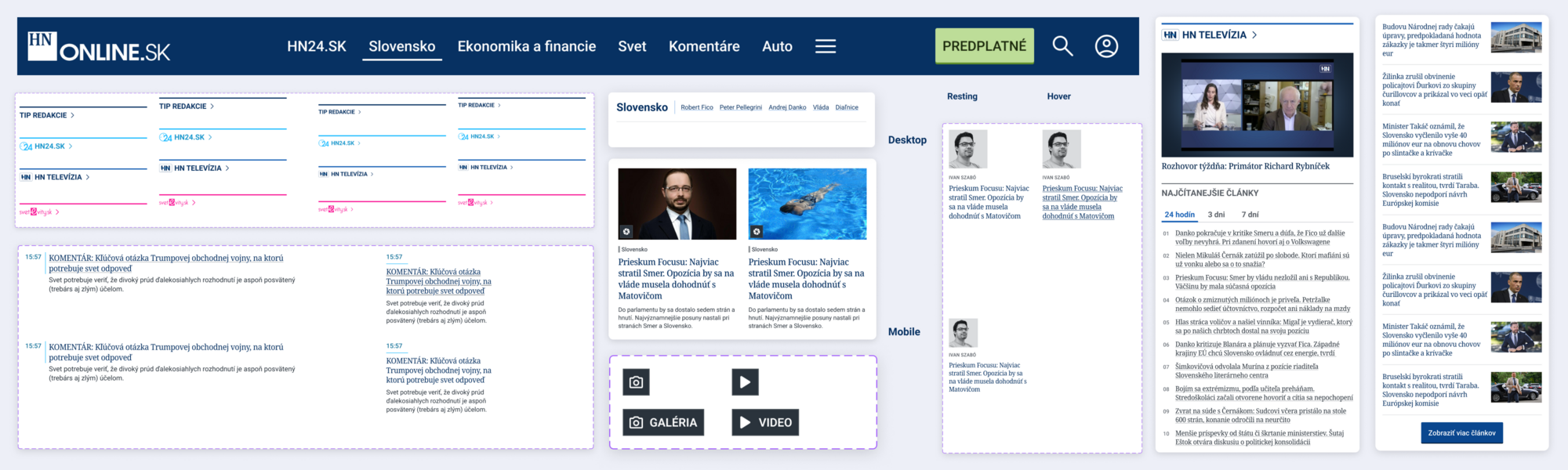
2. Content Management and Layouts
The layouts of the main page and categories were adjusted to better reflect the content hierarchy and support quick reader orientation. Articles are more organized, with clearer differentiation of content types.
3. Navigation and Structure
The main menu, article details, and navigation elements across the website underwent changes. The aim was to reduce users' cognitive load and simplify the path to relevant information.
4. New Content Formats
The redesign also includes photo galleries and quizzes that respond to changing forms of news consumption and support engagement.
5. Launch of HN Wiki
A significant novelty is the launch of the HN Wiki database – a new section with more than 2,000 entries and keywords. The database gathers information about public figures, companies, cities, and technical terms from various fields. The content is continuously updated and expanded, adding value directly in the context of news reporting.
Result
Redesigned HNonline.sk:
- Brings a more modern and clearer visual language.
- Improves user experience in reading and navigating content.
- Strengthens the credibility and authority of the Hospodárske noviny brand in the digital environment.
- Creates a solid foundation for further development of digital products and services.
HNonline.sk has been growing steadily in key metrics (PV and RU), even in the environment of paid content. Video content within HNtelevízia recorded more than 10 million plays over the past year, confirming the correct setting of the digital strategy.
Conclusion
The redesign of HNonline.sk is not a one-time visual change, but a strategic step in the development of the digital ecosystem of Hospodárske noviny. It shows that even a strong media brand with a long-standing tradition can grow in the digital environment if it connects content, technology, and user experience into one functional whole.
Role of ui42: digital strategy, UX/UI design, information architecture, digital product development.
You can read more about our collaboration in the article on HNonline.sk.
The digital environment is changing faster than ever before. Our ambition is to provide readers with quality and trustworthy content in a form that is natural and understandable for them, which is why we chose to collaborate with ui42 when redesigning the website's visuals.