The font is the most important visual element on predominantly text-based pages. This is undeniable. As part of creating the Unified Design Manual for Electronic Services of the Slovak Republic, we had to choose THE font that will be used in electronic services.
These were our initial requirements for font selection:
Sans-serif font - for better readability on electronic devices and mobiles.
- Similarity to the licensed font by Peter Biľak (Greta Sans) selected for the design manual of the Slovak Republic, which public administration bodies already use in offline communication.
- Support for all Slovak characters (Latin extended character set).
- Good readability/distinguishability of characters even for the older population or residents with visual impairments.
- Free license, so the state does not waste money unnecessarily if it is not necessary.
- Support for internet browsers and mobile devices (Webfont).
First shortlist
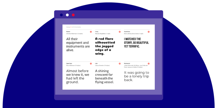
Based on my knowledge and with a little help from Michal Tornyai from the Union of Graphic Designers of Slovakia, we selected these potential fonts for the first shortlist. They are also displayed with a sample of a whole paragraph, where you can try if we will want to read those long official texts.
Gradual elimination
We gradually eliminated those that have some character flaw, such as Lato, whose "č" character is fine in browsers, but not offline.
We further excluded the fonts Noto Sans and Work Sans, whose characters are too far apart, thus taking up too much precious space on the screen. This was followed by the exclusion of another set of fonts Roboto, Fira Sans, and PT Sans, whose characters are so close together that it could cause readability problems for older people.
Final selection
Thus, these two fonts made it to our final selection:

Open Sans is currently already used on the slovensko.sk website, so the first thought was to maintain this fact. However, Mr. Machel from the Ministry of Culture intervened with a good observation. Notice the difference between the letters capital I and lowercase L. In Open Sans, the difference is minimal, it actually only differs in the height of the character. In contrast, in Source Sans Pro, the difference is clear. And this distinction can be crucial when introducing various abbreviations, which our laws are full of. And so it was decided, and Source Sans Pro won quite decisively.
Font size
Subsequently, I only determined such a font size for individual devices and all elements on the page to ensure good readability. Due to the slightly smaller size of the lowercase letter bowls (compared to the Open Sans font), it was necessary to enlarge the font overall. And this is not only for visually impaired citizens but also for everyone else. After all, it is known that after 40, people gradually start to become visually weaker because vision naturally deteriorates due to the decreasing elasticity of the lens. And according to the latest demographic data, people over 40 already make up 50%. So let's make sure we can see our laws well :-D
You can see the actual display size on your device directly on the ID-SK website in the Typography section.
One tip in conclusion
And one observation in conclusion - the most usable font is one that is readable even when it is just emerging on the screen from the bottom of the page. To test, just cover its bottom part:
Note:
The Unified Design Manual for Electronic Services of the Slovak Republic was created within SUXA (Slovak User Experience Association) and in cooperation with the Office of the Deputy Prime Minister of the Slovak Republic for Investments and Informatization.
Source codes can be found on GitHub https://github.com/id-sk.
If you are interested in quality graphic or UX services, do not hesitate to contact us. We will be happy to advise you.