A few years ago, the equation in e-commerce was relatively simple. If you had a visually more attractive e-shop than the competition, you won. However, today the reality is different. Most websites are technically advanced, fast, and design-wise clean. Despite this, we see a worrying trend in the data – visitors come, but leave without converting.

In practice, we increasingly encounter clients who have invested significant resources into redesigning with the aim of achieving a "wow effect." The result? The aesthetic experience grows, but business results stagnate.
Why is this so? Because in 2026, we are no longer just fighting for attention. We are fighting for the cognitive capacity of the customer. We must move from interface optimization (UI) to decision optimization.
The Aesthetic Usability Effect: Why Beautiful Design Isn't Enough for Higher Conversions
In UX psychology, we know a phenomenon called the Aesthetic-Usability Effect. Users tend to perceive aesthetically pleasing products as more functional. However, this effect only works up to a certain point.
A beautiful visual may build initial trust and a professional impression, but if it is not backed by clear navigation, logical information architecture, and understandable reasoning, it becomes just a facade.
The customer feels good on the website... until they encounter the first barrier in decision-making:
- they do not understand the differences between products,
- they do not perceive clear value,
- and they do not know what to do as the next step.
At that moment, aesthetics recede, and frustration sets in.
At ui42, we perceive design not as decoration but as a tool for reducing uncertainty. If the visual aspect does not answer the question "Why should I choose this product?", it becomes just visual noise without a business effect.
Visual Smog and Cognitive Load: How Design Hinders Purchase Decision-Making
Modern design trends like parallax scrolling, automatic videos, or complex micro-interactions are visually impressive. From a UX and conversion perspective, however, they are often counterproductive.
Why? Because they increase cognitive load.
The human brain has limited capacity when shopping online. Every extra movement, every animation it has to process, takes away energy from the most important thing – making a decision.
If we force the customer to think about how to control the interface, they have no capacity left to understand the value of the product. Successful e-shops in 2026, therefore, do not dazzle with effects but with radical clarity.
Instead of asking "How to make it prettier?" we ask "How can we make it easier for the customer to decide?"
Design in the Context of the Brand: Why the Apple Model Won't Work for Everyone
We often hear one sentence when designing e-shops: "We want it minimalist like Apple."
The problem is not in minimalism. The problem is in context. Brands like Apple or Nike have built extremely strong brand awareness. Their customers come decided. The web serves them more as a transactional channel than a persuasive tool.
Most e-commerce players, however, are in a completely different position. The customer comes with a degree of uncertainty, and your task is not just to show a nice product, but to:
- build trust.
- explain differences,
- guide the customer to the right choice.
Abstract design, hidden navigation, or ambiguous CTAs may seem premium, but for a new customer looking for a specific solution to a problem, they represent a barrier.
Functional design respects Jakob's Law, which means that users spend most of their time on other websites and therefore expect your website to work the same way as the sites they already know. Design should reduce the need for learning, not increase it, and use familiar behavior patterns.
Innovation in design should never come at the expense of the predictability of the purchasing process.
From Aesthetic Impressions to Data: Strategic E-Shop Design in 2026
If we look at market leaders like Amazon or Booking.com, we find one thing – their design is not about beauty. It's about efficiency.
They are precisely tuned conversion machines that respect user psychology and work with data in every detail:
- Predictability – the user knows what to do next.
- Speed of decision-making – key information is where the eye expects it.
Focus on value – the product and its benefits take precedence over graphics.
Does this mean we should make ugly websites? Not at all.
It means that aesthetics must serve function. Design in 2026 must be a strategic partner of the business, not just a visual artifact.
Conclusion: How to Design E-Shops That Help Customers Make Decisions
At ui42, we believe that true CRO is about understanding what is happening in the customer's mind. When you next look at your e-shop, try changing your perspective. Don't just look for visual errors. Ask yourself:
- Does this element help the customer in decision-making, or does it just distract them?
- Is the path to purchase intuitive even for someone who doesn't know our brand?
- Are we building on assumptions or on data?
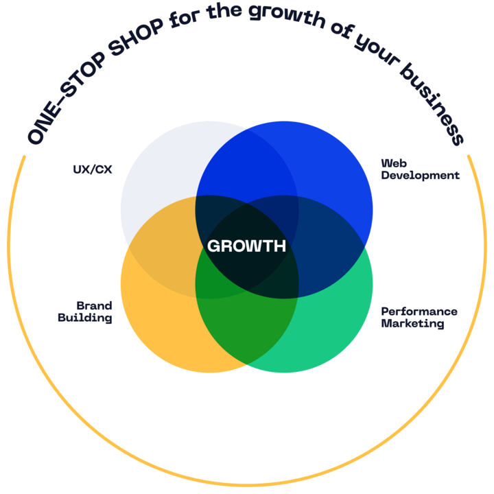
If you want to move your e-shop from the realm of "pretty picture" to the realm of effective sales channel, contact us. At ui42, we connect modern web and e-shop development, UX and CX design, CRO, marketing and custom AI solutions into one functional whole, because only such an integrated approach can sustainably increase the value of your business in the digital world of 2026.