Color palette
Veronika VerešováWhat does it mean
The color palette in the context of branding is a set of selected colors that a brand uses in its visual communication. It is not just a random selection of favorite shades, but a strategically chosen combination aimed at evoking specific emotions, ensuring brand recognition, and unifying the appearance of all outputs – from the logo and website to social media posts and packaging design.
More info
A well-designed palette usually includes primary colors (dominant for the brand), secondary colors (complementary), and neutral colors (for text and background). In digital design and branding, these colors are defined by precise codes (HEX, RGB for screens, and CMYK or Pantone for print) to ensure that the brand looks identical on an iPhone, computer monitor, and printed billboard.
When creating a color palette, designers rely on color psychology. For example, blue often evokes trust and professionalism (used by banks and tech companies), while red symbolizes energy, passion, or appetite (common in the food industry).
Color Palette as the Cornerstone of a Strong Visual Identity
In online marketing and UI/UX design, a color palette is much more than just an aesthetic element. It is a tool that guides the user's attention and builds a subconscious connection with the brand.
Linking Color Palette and Branding
-
Building Recognition: Consistent use of the palette increases the likelihood that consumers will remember your brand. Just seeing a specific shade of magenta or blue immediately brings to mind a telecommunications operator or social network.
-
Emotional Impact: Colors communicate brand values without words. The right palette can evoke a sense of luxury, eco-friendliness, playfulness, or safety, attracting the right target audience.
-
Visual Hierarchy in UI: On a website, the palette helps the user navigate. A clearly distinguished color for CTA (Call to Action) buttons guides the visitor to action, while softer tones define less important sections.
-
Accessibility: Part of a professional palette is also testing contrast. Properly chosen color combinations ensure that text is readable for all users, including those with visual impairments.
Benefits of a Defined Color Palette
-
Consistency Across Channels: Whether a customer opens your newsletter or sees an ad on Instagram, the visual impression remains consistent, increasing the company's credibility.
-
Faster Content Creation Process: With a clearly defined design manual and palette, designers and marketers no longer have to decide "what color to use today" for each post.
-
Professional Impression: Harmoniously coordinated colors appear polished and thoughtful, distinguishing established companies from amateur projects.
-
Psychological Influence on Purchasing Behavior: The right colors can stimulate urgency (sales) or, conversely, calm during a difficult decision-making process.
How to Create an Effective Color Palette
-
Analysis of Target Audience and Competition: We find out what colors the target audience prefers and how to differentiate from the competition in the given segment.
-
Choosing the Primary (Hero) Color: This color represents the brand's identity and is most present in the logo.
-
Applying the 60-30-10 Rule: A popular design rule where 60% is the dominant color (usually neutral), 30% is secondary, and 10% is accent (a striking color for important elements).
-
Testing in a Digital Environment: Verifying how colors appear under different lighting conditions (Dark mode vs. Light mode) and whether they meet readability standards.
-
Defining in Brand Manual: Recording exact values (e.g., #FF5733) to prevent deviations in the production of various materials.
A color palette is not just about beauty; it is a strategic tool that makes your branding memorable and your website usable.
Latest news
The number of steps in the cart does not determine the conversion of the e-shop. This does.

Innovations are not about discarding the past. They are about building the future on it.
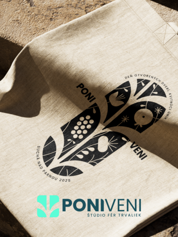
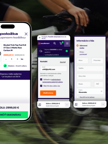
Case Study Poni Veni: E-shop with a revenue growth of +15% YoY

Case Study: UX that drives thousands of cash registers across 5 markets

Withdrawal from the contract online: From June 19, 2026, e-shops will face a new obligation

Business Guide AI Enterprise
Andromeda in Meta Ads changes ad performance

When will the AI agent start lying to the user? We tested 5 models.

Digital Pie 2026: four awards out of six. Our best year yet.

Management and strategy of working with AI tools in large companies
Contact us
Everything for the growth of your business in one place
At ui42, we combine strategy, creativity, technology, marketing, and AI into one entity.
We build brands and visual identities, create websites and e-shops, design UX and CRO, create creative content, and deliver measurable results through performance marketing.
Our solutions are enhanced by FLUIDUM – ui42's AI intelligence, which transforms company data into a competitive advantage.
Thanks to this, you gain a partner who can cover the entire digital ecosystem of your business – from the first contact with the brand to conversion.

Don't miss out on the latest news from the world of UX, programming, analytics, and marketing.

Thank you for subscribing!